Great web typography is perhaps one of the most underrated aspects of digital design. Finding the happy medium between what looks good and what reads well is an extremely challenging task, and it requires extensive knowledge about the relationship between screens and consumers.
In this guide, we’ll take a look at some of the most common challenges of creating great web typography as well as objectives and principles you can use to help shape your understanding of typography in web design.
Main Challenges Of Web Typography
Web typography is a lot more complex than its printed alternative. On a physical page, designers have much tighter control over the color choice, size, clarity, and orientation. But when it comes to a digital webpage, there are very different variables to consider.
1. Screen size
When the user interface (UI) is designed adaptatively or responsively, the text on a screen modifies depending on its size. The way words appear on a smartphone will be different than on a PC, and typographers need to account for that.
2. Screen Calibration
Different screen brightness settings affect how users interpret color and light. The typeface colors designers choose need to accommodate these deviations.
3. Screen resolution
Text legibility is intimately connected to pixel density. Designers need to develop typography that accounts for older tech that doesn’t necessarily present text clearly.
When developing typography for any website, bearing these three challenges in mind can help designers achieve their goal of seamless readability and visual interpretation. In doing so, the user experience (UX) is improved, and the site becomes more impactful.
What Should Digital Text Be Designed For?

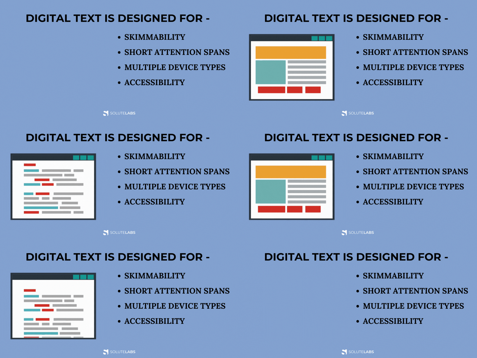
In addition to understanding the challenges often posed by web typography design, it’s important to have some clearly outlined goals and objectives. Try bearing these four in mind for more effective and visually coherent web typography:
1. Skimmability

Users want to be able to skim through both large and small bodies of text effortlessly. Make this as easy for them as possible.
2. Short Attention Spans
People’s attention spans are shorter than ever. Stick to typefaces that grab users’ attention quickly and deliver their message promptly.
3. Multiple Device Types

Smartphones, tablets, laptops, and PCs all need to get factored in when designing web typography.
4. Accessibility
Good web typography should be designed with a diverse group of people in mind. When creating typefaces, it’s essential to consider those with vision or cognitive disabilities too.
Ultimately, designers need to aim to create typography in web design that is clearly visible, easy to read, fits well into multiple device orientations, and can accommodate a wide demographic of people from around the world. These objectives make for an excellent guide for creating great web typography.
Web Typography Principles Every Designer Should Know
While general objectives are great, practical tips are even better. To produce the most readable and succinct typography possible for the best UX, designers can follow these expert-approved principles.

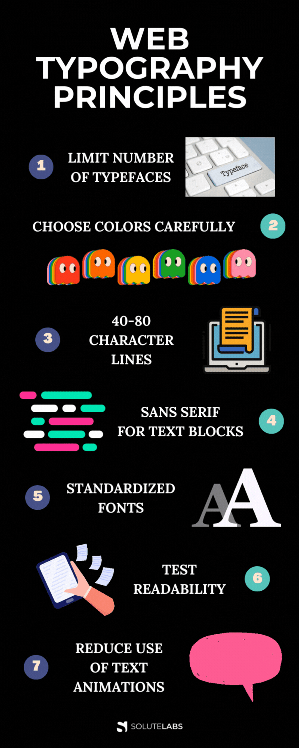
1. Limit the Number of Typefaces
The more typefaces you have on a webpage, the more visually confusing the UI becomes. If your objective is to make the text as readable as possible, limiting the typefaces is a good place to start. Most designers recommend sticking to 2-3 typefaces to avoid cluttering up the screen.
It’s also advised that typography designers remain consistent with the choice of fonts for different elements. For example, if you have one font for headings and one font for the body, don’t use them interchangeably.
2. Choose Colors Carefully
It’s important to distinguish the difference between web design and web typography design. Someone skilled at developing fonts for a website doesn’t necessarily understand the nuances of color composition.
But if you want your typography to succeed, learning the basics will certainly help.
One of the biggest mistakes regarding color and typography is the poor pairing of background color with font color. They need to complement each other but also have enough contrast that the words don’t just blend into the background.
Generally speaking, the color pairings that work best for web pages and fonts are black and white. Red and green are best avoided due to the common issue of color blindness but other complementary colors work well.
Your text should always be the darker color and the background lighter, unless you are working on a dark mode principle, in which case this is reversed.

3. Stick to 40-80 Character Lines
When it comes to inserting larger bodies of text, there needs to be some restriction to line length. You don’t want users to feel bombarded by heavy chunks of text. So, make sure to spread text out evenly throughout the page. A 40-80 character line limitation works best.
Line length also needs to be balanced with white space. This has become something of a trend in recent years, as mobile use has skyrocketed. By adding white space between lines of text it becomes more readable and the web typography on the page stands out better. This also makes content more skimmable and quickly lets readers pick out any important facts.
4. Use Sans Serif for blocks of text
Serif fonts are fonts that have little curves or decorations at the tips of each letter. This is not what you want for a digital typeface, because it can distract from what the words are saying.
Instead, the clean-cut edges of sans serif fonts make for much clearer, more legible reading. This helps users to scan through text with greater ease, and better appeals to their limited attention spans.
Some of the most popular and easy-to-read sans serif fonts include:
- Calibri
- Arial
- Futura
- Helvetica
- Roboto
5. Stick to Standardized Fonts
Sure, unique, non-standardized fonts are cooler and perhaps more interesting. However, they may not be accessible for certain types of tech or different screen sizes.
Therefore, it is always smarter to stick with standardized fonts. In doing so, you can rest assured that everyone who encounters them will see your web typography exactly the way you designed it. Besides, there is still a wide variety of standardized fonts that look equally good as non-standard ones.
6. Thoroughly Test Readability
Test, test, and test again. Your font size matters and studies conducted on the topic have revealed that there are some sizes that work better than others. Larger is obviously better as it allows the reader to absorb more information at a glance, but not too large. You don’t want to overwhelm the reader or make them scroll endlessly down the page just to get past the main headings.
Size 18, 22, and 26 fonts all have a high readability rating. Font size 22 delivers the best reading experience. However, this font is quite large, especially for mobile. When creating a balance between easy reading and screen real estate, font 18 is the generally used option as it’s large enough to be properly legible. Plus, eye-tracking studies show that there’s a noticeable jump in the retention of information when font sizes are increased to 18.
Good typography doesn’t just make your content readable—it also guides user behavior. When paired with strategic layout and compelling CTAs, it can dramatically boost conversions. If you're looking to take it a step further, learn how to design landing pages that actually convert.
Even if you choose these recommended font sizes, you won’t know how your web typography reads until you get a wide group of differently-abled people and screens to test it. All web typography designs should be rigorously tested by users before being published officially on a site. When it comes to creating the ideal UI, practice makes perfect!
7. Reduce your use of Text Animations
While text animations do grab users’ attention quickly, few things detract from readability like a moving, bouncing image. If you’ve ever tried to read a block of text while simultaneously seeing a flashing, distracting animation, you’ll understand why avoiding this is your best shot at creating legible text.
Animations are great for inserting into other areas of a website or webpage but aim to keep them separate from text-heavy areas to make it easier for people to absorb information clearly.
Also, Read: How To Perform A UX Audit: A Step-by-Step Guide
Legibility Leads The Way
Web typography plays an absolutely crucial role in every website, whether it’s a static business site to an ever-changing online portfolio. And yet, much of its success goes unnoticed. But that’s kind of the point. A good typography designer’s goal is not so much to steal the limelight, but rather to make text legible so that nobody thinks twice while reading it.
This is an arduous task that requires much experience and expertise. By following the tips and information in this guide, any designer can improve their web typography skills.
Do you need a sound and exemplary design for your SaaS? Contact Us and we will get in touch with you. Our highly experienced design team at SoluteLabs is keen to help you with your design to make it successful!
