Typography in UX Design - Types, Benefits & More
Karan Shah•3 Aug 21•10 Min read

It does seem simple on the surface that choosing a font for your next design project is no big deal, but the effect of typography in UX goes deeper than you think.

Whether you are working on a website or a digital product or marketing assets, it is imperative to get your message across clearly to the target audience. And, the kind of typography you choose can either make or break your communication. The intent of this post is to help you understand the following key points -
- What is typography? Is it the same as font or typeface?
- Different types of typeface
- Typeface basics
- The importance & benefits of typography in design
- Guidelines/principles for choosing a typeface
- Apple guidelines for typeface for your app
- Material design guidelines for typeface for your app
- Typography and accessibility
- Ending notes
- FAQs
What exactly is typography?
The word “typography” in English takes it root from the Greek language τύπος typos (‘impression’) and -γραφία -graphia (‘writing’).
According to Wikipedia,
Typography is the art and technique of arranging type to make written language legible, readable and appealing when displayed. The arrangement of type involves selecting typefaces, point sizes, line lengths, line-spacing (leading), and letter-spacing (tracking), and adjusting the space between pairs of letters (kerning). The term typography is also applied to the style, arrangement, and appearance of the letters, numbers, and symbols created by the process.
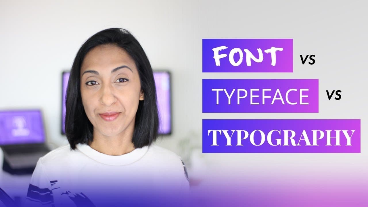
What is the difference between font and typeface, you might ask?
Many people use the words font and typeface interchangeably. However, there is definitely a difference between these.
In simplest terms, a Font is a part of a Typeface. So, for instance, Inter is a typeface — a complete set of sans serif characters with a common design principles. However, it comprises of fonts, each in a specific weight, style and size, with different levels of condensation as well as italic versions.
A typeface is a design style which comprises a myriad of characters of varying sizes and weight, whereas a font is a graphical representation of text character. Put simply, a typeface is a family of related fonts, while fonts refer to the weights, widths, and styles that constitute a typeface. — Jaye Hannah, Career Foundry

In case you want to learn more, check out this cool video -
You might have come across style guides or design systems wherein designers give complete details about the overall communication style including that of typography. Take a look at some examples here -


Typeface classification

Typeface basics
While understanding a typeface, one must also understand other key aspects like the following -
Mid line — Also termed as mean line, this is the line which tells where non-ascending lowercase letters terminate in a typeface. The distance between the baseline and the mean line is called the x-height.

Base line — This is the line upon which most letters “sit” and below which descenders extend.
Ascender and Descender -

If you see the above image, the upward stroke above the x-height in a lowercase letter like d, b, or h is the ascender. Fonts like Dawnora Headline has short ascenders which make the letters appear wider. The descender is the opposite: it reaches from the baseline to the descent in letters like q, p, and j.
Letter spacing — Also known as tracking, letter-spacing is an optically-consistent adjustment to the space between letters to change the visual density of a line or block of text.

Kerning — In order to produce an aesthetically pleasing result, kerning is used to adjust the space between characters in a proportional font. It’s sort of a process.

Kerning helps adjust the space between letterforms. The term, sometimes, is used to imply poor kerning when letters are placed too close together.
Leading — In context to digital products, leading is often referred to as line spacing or line-height. It is the space between multiple lines of type, which can be as few as two lines of type to, well, as many lines as needed. Leading is measured from baseline.

The importance & benefits of typography in user experience design
One of the keys to getting user experience right is communication. And, typography plays a big role here. If your users understand what your product does and are able to engage with it, your business will go a long way.
When it comes to text, you just go beyond readability. The typography you choose for your product and its branding must convey your product’s personality & mood. It should be able to evoke emotions subconsciously to help your users take desired actions.
Helps shape your brand’s personality —
Fonts have a voice of their own. What you use on your product/website, sort of talks about how your brand would be, if they were a person.

Curved vs sharp, straight vs inclined, thin vs bold, and a lot more criteria like these one, decide how your brand would come out to your visitors and customers.
Set expectations -
Depending upon how your brand is perceived, your users are bound to form bars of expectations from you.

This includes aspects like how professional your service would be, how approachable your people are, how flexible your processes are, how transparent your policies are and how reliable your promises are. The kind of typeface you use on your website/product, subconsciously decide what your users expect to see in you.
Creates the right visual hierarchy -
We cannot stress enough on this point. The combination of typefaces you uses, and the font sizes you choose, decide on the visual hierarchy of information on your web asset. That would impact the quickness and depth of your messaging strategy.

People absorb what they can skim through vividly. Typefaces and their sizes decide on which message would be absorbed and which ones will be filtered out of your readers’ minds.
Better conversions —
This is the direct result of the above point. The clearer and more accessible your core messages and CTA’s are, the better would be the conversion that you see.
Aesthetics without the graphics—
Typefaces chosen correctly, can fill up aesthetic gaps even if you are running short of appropriate graphics.

In fact, a lot many brands choose to go the only typeface way to reduce distractions by graphics and animation, while still maintaining a subtle sense of ‘looking good’.
General guidelines for choosing a typeface for your brand/product
- Make sure you use no more than 2 fonts for website/app/digital product. Careful determine your brand’s personality and choose a font combination. For instance, when you download fonts from Google Fonts, it recommends font pairings. Here is a list of tools you can use — https://dribbble.com/resources/tips/font-pairing-tools
- Make sure to use proper size and line heights. Also, keep in mind multiple breakpoints for your design. You will have to tweak the size and heights in accordance with the breakpoint you are designing for. Nick Babich recommends the following -
For desktops: Use 16 px font or higher for body text. It’s not too big, and it’s comfortable to read.
For iOS devices: Use a text size that’s at least 11 points (it’s legible at a typical viewing distance without zooming).
For Android: Minimal readable font size is 12 sp, but it is highly recommended to use at least 14 sp for the main text.
- Next, ensure that the line length (the amount of characters on each line) gives a comfortable reading experience. The WCAG recommends keeping a line of text’s character count below 80 characters.
- Avoid using big paragraphs. It decreases readability, no matter how good a font is. Blocks of text will lead your users/visitors to abandon your website/product more quickly. This increases bounce rates and lower rankings on Google.
- Say no to ‘All Caps’. It reduces the comprehension ability.
- When it comes to spacing between lines, a rule of thumb is — leading (explained above) should be about 30% more than the character height for good readability.
Apple Human Interface Guidelines for Typography
While designing apps for iOS and macOS, Apple has a ton of typography guidelines which help deliver a great user experience.
Designing products for macOS
Apples products use the San Francisco (SF) system font. The SF Pro variant is the system font in macOS. This ensures better legibility, clarity, and consistency with apps across Apple platforms.

- Whenever you are designing macOS apps, use the built-in text styles to express content in ways that are visually distinct, while retaining optimal legibility.

- Like mentioned earlier, don’t use too many fonts. It will break the user experience across Apple devices. Using one font is the best.
- When you display text in wide columns or long passages, more space between lines (loose leading) can make it easier for people to keep their place while moving from one line to the next. Conversely, if you need to display two lines of text in an area where height is constrained — for example, in a list row — decreasing the space between lines (tight leading) can help the text fit well. If you need to display three or more lines of text, avoid tight leading even in areas where height is limited. The system defines API that lets you increase or decrease the space between lines by two points; for developer guidance, see loose and tight (SwiftUI), and looseLeading and tightLeading (AppKit). (Source: developer.apple.com)
- If you plan to use custom fonts, make sure to choose these very carefully. See if these look proper on smaller screen sizes.
- Pay attention to tracking. Modify as and when required.
For full detailed guidelines visit — https://developer.apple.com/design/human-interface-guidelines/typography
Designing products for iOS
When designing specifically for iOS, there are different fonts you can use. Apple highly recommends these.
- San Francisco
- New York
- SF Pro and SF Compact
- SF Pro Rounded and SF Compact Rounded
- SF Mono
Like mentioned above, you will have to pay attention to tracking, leading, font sizes and weight. Go here to see the technical details for iOS typography — https://developer.apple.com/design/human-interface-guidelines/typography
Google Material Design Guidelines for Typography
Typography theming allows you to create styles that work well with your brand’s overall personality. Start by defining a set of type scales which can be used across your app. Material components can use these type scales to style their individual text appearance.

Type Scale — This comprises a range of contrasting styles which support the needs of your product and its corresponding content. It includes a combination of thirteen styles that are supported by the type system. Type Scale design system has reusable categories of text, each with an intended application and meaning.
Use the Type Scale Generator by Google Fonts — You can create type scales and the corresponding code with it. Pick up any font and it will be automatically resized & optimized based on Material typography guidance for readability.

Here’s an example of Roboto type scale -

For full typography guidelines visit — https://m2.material.io/design/typography/the-type-system.html
Typography and Accessibility
When it comes to accessibility, its more than just choosing a legible typeface. When designing digital products for people with learning disabilities, dyslexia, poor vision & similar others, accessibility tops the chart. We need to make sure that text is as accessible as possible. Never use curvy, flashy fonts when it comes to developing such products. Some things to keep in mind -
- Conduct user research studies to finalize the font. Pick 3 that you think are accessible and run them through the group.
- Have adequate letter spacing. Again, choose the font depending on your audience type.
- Go for humanist typefaces instead of grotesque typefaces.
- Make sure the letters are distinguishable.
- Avoid typefaces that have imposter letter shapes.
- Keep away from mirroring letter shapes.
Ending Notes
Typefaces play a huge role in determining the UX of your digital product. Keep testing your interface with your target audience and design & iterate accordingly. You can’t go wrong when you listen to your users.