Web design has many purposes. Whatever the nature of a website — commercial, non-profit, community, or any other- it must have two qualities. It needs an exemplary user interface (UI) and a good user experience (UX). For these purposes, it needs to be aesthetic and functional.
In the last twenty years, new ways of accessing internet websites have emerged. Many now prefer tablets and mobiles over PCs for connecting to internet websites. But with varying screen sizes comes a new challenge. How do I make a website look and work perfectly regardless of the accessing device? How do I ensure a good UI and a great UX regardless of screen size?
Primarily there are three ways of achieving this:
- Make a standalone website
- Make an adaptive website
- Make a responsive website
Of these three options, designers and businesses prefer not to make a standalone website (usually). It involves more maintenance as well as upfront costs. Today, I will discuss with you the remaining two options. Consider this article a debate on adaptive web design vs responsive web design. I hope you leave this read with a clearer idea of what these two are. And also which one of them would serve your interests best.
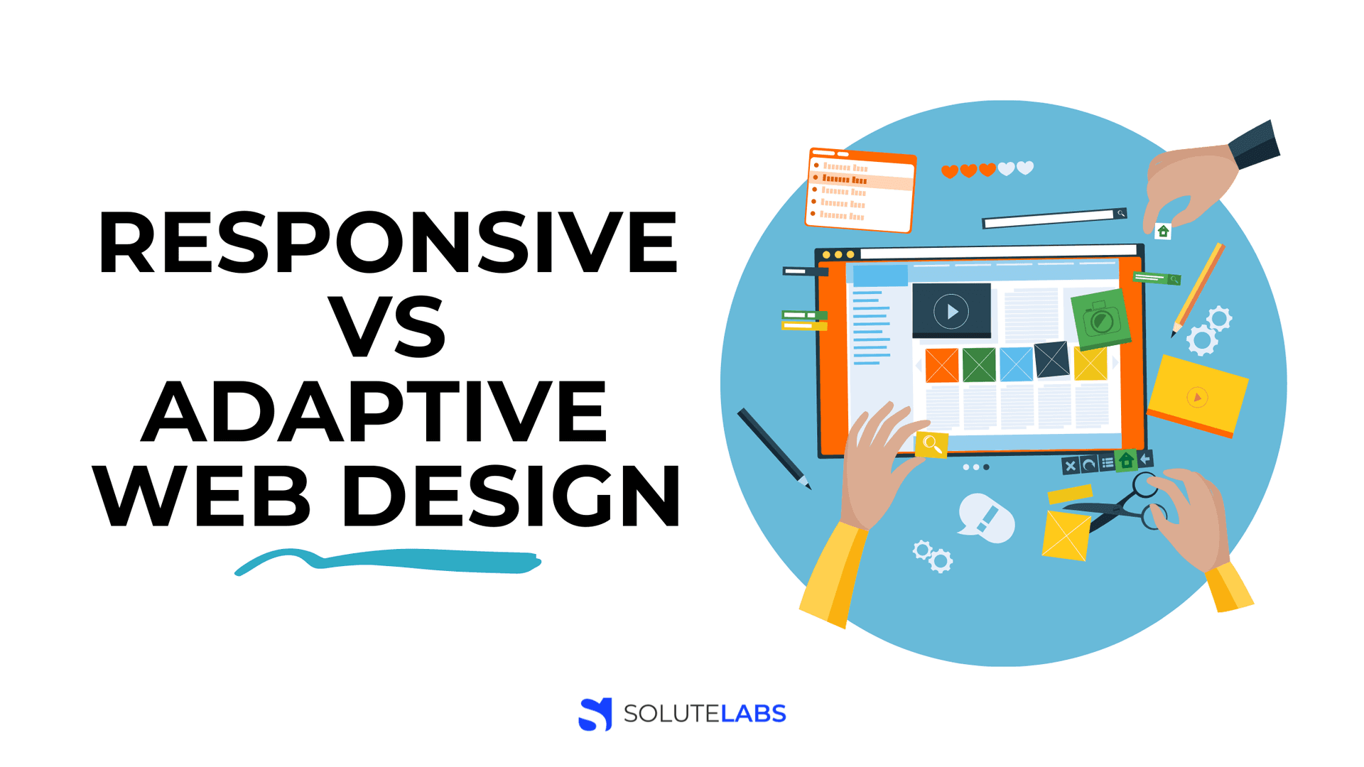
What is Adaptive Vs Responsive Web Design
Adaptive design is about creating a different website layout for every screen. The website recognizes the screen size and serves up the layout created for that viewport. A different UX can be created for each of the six common screen sizes. These screen sizes are 320px, 480px, 760px, 960px, 1200px and 1600px. They represent screens from the smallest to the largest. Practically it isn’t easy to design with six sizes in mind. One way around this is to check user analytics for the most accessed screen sizes. Suppose analytics show that users accessed the website on an iPhone and an iPad the most, then designers may choose to design with those two screen sizes in mind.
Responsive design uses the principle of fluidity. The same background code is viewed on different devices. The appearance and layout change based on the device's orientation and size. CSS is used to ensure that the web pages are reformatted according to the viewport size. This means only one codebase is needed regardless of the device used to view the website. "Breakpoints'' inform the site of the adjustments needed based on different screen sizes.
This means a site I create may have four columns on the PC, three when viewed on the tablet, and two when viewed on the mobile phone. But all these devices will carry the same design and content. To achieve this UX designers and developers need to work closely
Difference Between Adaptive And Responsive Web Design
#1: Adaptive devices load the pre-designed web page content based on the device. Responsive devices only adjust the width and content based on the device.
#2: Adaptive design takes a lot of work. Designers need to create six versions of the site for six screen sizes. Responsive design takes a minimum of work since only one layout design is created.
#3: If a new screen layout hits the market, Adaptive designers need to create a brand new page. Responsive design allows the web page to automatically adjust to a new screen layout.
#4: Adaptive design is suitable for smaller sites that are renewed. Responsive sites work great for large sites that are being built from the ground up.
#5: Adaptive design is great for updating a current site to make it mobile-friendly. Responsive design is great for less experienced developers using CMSs such as WordPress and Joomla.
Adaptive Web Design Vs Responsive Web Design: Why Choose Adaptive?
- Adaptive websites are fast and beat responsive websites on speed tests.
- Adaptive websites provide a great user experience.
- Advertisements on mobile gadgets can be easily optimized on adaptive websites. You can maximize mobile traffic revenue with adaptive sites.
Also, Read: 15 UX Tips for great Progressive Web Apps (PWAs)
Web Design Adaptive Vs Responsive: Why Choose Responsive?
- Responsive web design is easier to implement.
- Responsive web design is widely used.
- It works automatically for every device and screen size.
- It enables swift website design and creation.
- You can choose from one of many available design templates.
- It is search engine friendly.
Adaptive Vs Responsive Design: Which Is Better?
Perhaps the debate of adaptive versus responsive web design is a stalemate. There is no clear winner. It all boils down to who the audience is. When I know who they are and the devices they use to access the site, it's easier to pick a choice between adaptive vs responsive design.
Also, my choice of design would depend on whether I’m designing from scratch or remodeling an existing site. If you have the budget and workforce for it, go for adaptive web design. It is much faster than responsive design with extremely fast load times. This is why responsive design — the popular choice is not always the best for smartphone users.
Responsive design seems to be gaining market share and emerging as the preferred choice for designers. So if you want a quick, convenient solution that does not require ongoing work, choose a responsive design.
Responsive vs Adaptive Design: What the Future Holds
Adaptive Design
According to one viewpoint, the future of design is adaptive. This school of thought argues that new content types like 3D printing, 3D images, and 4K resolution mean that responsive design can’t handle these. To unleash the possibilities of online advertising, too, you need an adaptive design - for adaptive ads. Adaptive landscapes make more sense for devices like the Xbox One. Because adapting to different screen sizes as the responsive design does isn’t enough. What’s needed is to adapt to different devices. For new devices like smartwatches, connected TVs, and next-gen gaming systems, only adaptive design can do the trick. Also, experts argue that only adaptive design offers better interaction with websites and portals.
Responsive Design
Some developers argue that responsive design is the way forward. Apart from the obvious advantages, responsive design now takes into account location detection, time, light levels, and device orientation to serve up the user experience.
Location detection (geolocation): This browser-based detection mechanism is common today. When I search for “cloth shop” on Google, I am served up responses from stores near me. When I search for “pizza shop,” likewise, I am shown the nearest pizza shop. This is the magic of geolocation. Geolocation is opening up possibilities that were never thought of before.
Light levels: The UI is adjusted based on light levels. An application called Flux helps you fall asleep at night by neutralizing the blue glow of your screen at night. Apple’s new iOS also now offers night mode, which does the same thing. In this way, responsive design can ensure maximum comfort for the eyes and the mind.
Time: Responsive design is now taking your local time into account to serve you a personalized experience. I can easily implement a time-based experience for my user with packages like Moment.js.
Battery Detection: I can now access battery levels in the browser UI and tailor the user experience based on this. If my battery level is low, I can provide the user with a simplified UI without high-res images and unnecessary data.
Device Orientation: Responsive design can use device orientation to make your user experience better. CSS properties can now style things differently based on orientation.
Quick To Know Checklist
- Responsive designs automatically adjust to device and screen size. They don’t need a new layout creation based on these.
- Adaptive designs need different layouts created for different screen sizes.
- Responsive designs require less work from the designer. However, responsive site designers need to collaborate with developers to ensure the site works at different screen sizes.
- Although adaptive designs require more work (creation of six layouts), they result in optimal user experiences.
- If you are designing a big site from scratch, responsive designs may be the best choice.
- If you are just refreshing a small site, adaptive designs may be the best choice.
Also, Read: What role does UX play in the success of a product?
Conclusion
Although responsive designs are likely to retain popularity, for some sites adaptive designs make more sense. Innovations may change the scope of the game.
At Solute Labs we design rich, functional UIs based on your exact requirements. Call us today and begin your journey into the high-ROI world of superior solutions built for the web and mobile.