Flutter lets you build cross platform apps — But What About ‘Design’?
Karan Shah•9 Feb 21•11 min read

Our product development company has engineered a handful of cross platform applications using Flutter. The number one question that I get every time, I talk to a startup founder or business owner is — Do we need to spend on creating separate designs for Android and iOS? How will we ensure we deliver a consistent experience across devices & platforms? This post is an attempt to address this concern. I will also discuss about what it means to truly deliver a cross platform experience when contexts vary.
Flutter has come a long way since its Launch in May 2017. In fact, it has conveniently, morphed into a multi-platform app development framework. Besides developing cross platform apps, Flutter now allows you to build apps for desktop, web and even embedded devices.
Also, the number of Flutter apps on Google Play Store has steadily risen to around 90,000, clearly depicting its popularity. April 2020, saw around 80% spike in the number of Flutter-built apps. Across the globe, close to 2 million developers use Flutter to build a variety of cross-platform apps for startups, enterprises etc.
However, one can’t help but think about -
What happens to the UI/UX design of a Flutter-based app?
More importantly,
How will you manage two different UI in a single code-base? You can’t take the ‘if/else’ route everywhere. Does Flutter render the iOS Cupertino style on iOS and Material on Android with a single codebase. I need to know this before starting to develop my app with Flutter.
Since Flutter allows developers to churn out multi-platform applications with a single code-base, business owners often worry about how do we ensure that the flutter UI/UX design looks flawless and consistent across devices.
You, know, there is a sea of devices in the market with different screen sizes and resolutions. How are you supposed to factor that in? And, I haven’t even talked about the orientation — landscape or portrait.
Take a look at this and you will understand what I am talking about. And, that’s just iOS. When you start thinking about Android, you will be like -

Device fragmentation adds a very deep layer of complexity when you do both flutter design and development for any application.
There are now more than 24,000 distinct android devices in the market. That’s six times than what was in 2012.

This can make anyone crazy.
If you are any business like Easy Diet Diary, you would want to have a great iOS & Android mobile app that delivers a native-like experience, offers solid performance and still saves your money.
One single code base can deliver this consistency -

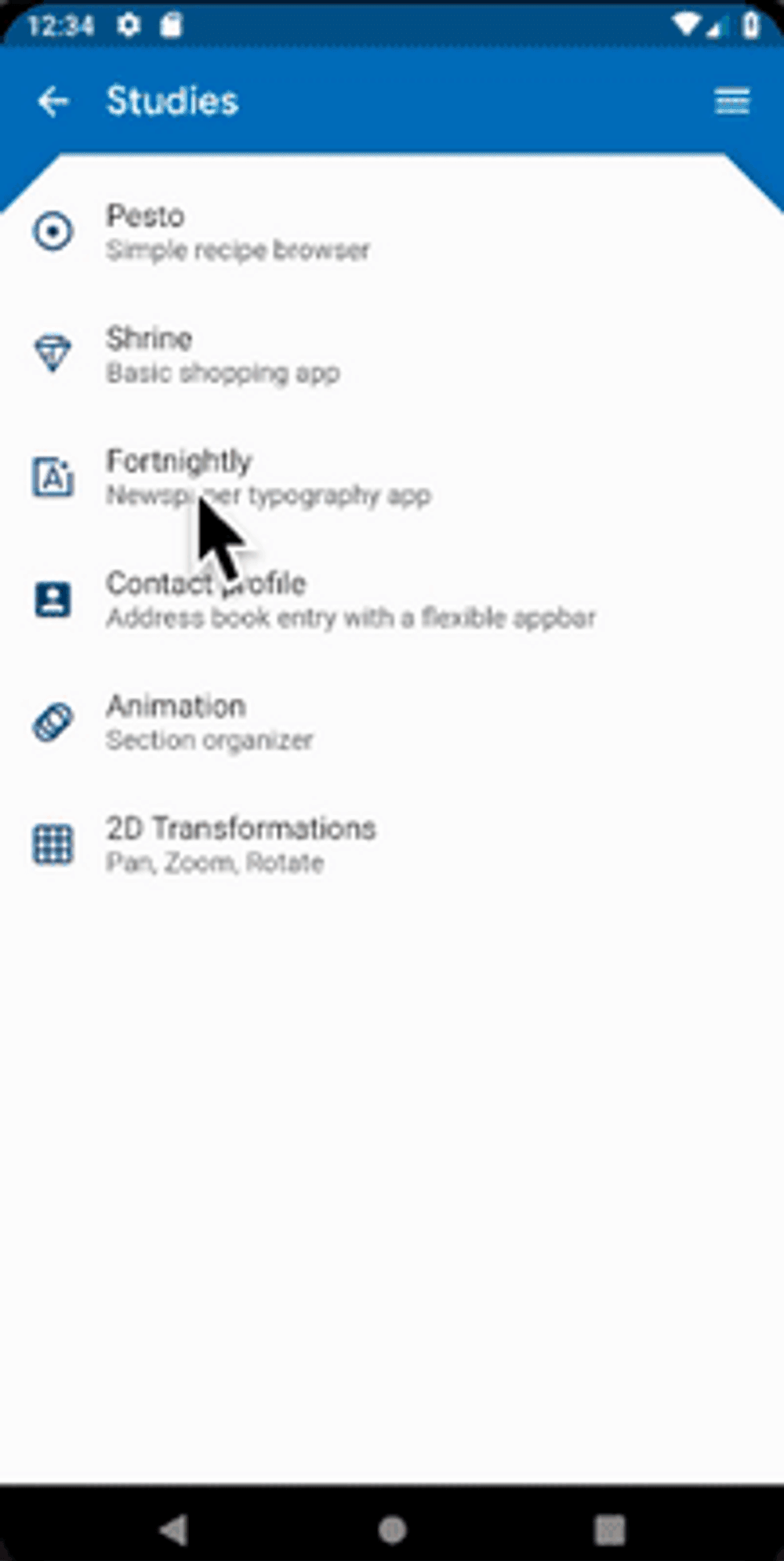
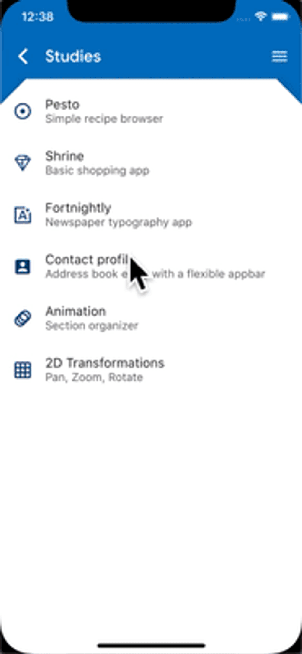
The UI/UX looks strikingly similar except for some differences like alignment of text, up bar, bottom navigation etc. of the respective platforms.
(Note — If you want to learn more about the flutter simple UI design differences between Android and iOS, here is a good article about it.)
Platform Aware Widgets
In case you want to keep your users in their defined environment and want to follow Material Design for Android & Cupertino Style for iOS, you can do so by using Flutter widgets. There are packages you can rely on which are equipped with native iOS & Android widgets to help your app give a platform-specific look.

But, one question arises when you go ahead with this approach -
Why not go for the native way and still have some reusable code?
On the surface, it looks like a fair and simple question. You can go this way but you will be making a costly mistake. There will actually be two implementations. Exactly the opposite of what you want. Your dream of re-using the native code will disappear in thin air because both iOS & Android have different needs in terms of initialisation and dependencies.
What is Adaptive UI/UX?
Before technological advancements, designers used to only make web-based versions. As different devices rolled out, designers began customising for mobiles and tablets. Cross platform experiences are designed revolving around these scenarios.
Rody Davis, a developer advocate at Google, very succinctly explains what adaptive ui/ux means -
When we build UI we need to create adaptive experiences that go from a watch, passive modes on a TV or voice only, mobile devices, desktops and everything in between. It takes extra work but if you follow these patterns you will save a lot of time later.
Flutter, as I discussed earlier, is becoming an all-platform framework. What about when you want to go smaller or bigger? Imagine Watch or TV.

Consider foldable phones for that matter. Flutter supports that too.
Adaptive layouts are precisely all about how your app appropriately displays the UI on the device it is being viewed on.
You no longer need to build separately for these multitude of devices. Flutter already supports that using a single code-base.

How do you design these adaptive experiences?
Here are some guidelines to consider-
- Looking for opportunities to design adaptive components. These are discrete collections of shared elements. It’s like using the same atoms in different molecules.

- Consider adaptive components like designing for multiple experiences using the same content. When designers come up with these concepts, you should consider when it makes to sense to develop widgets for the same that automatically adapt to different cases.
- When you do build widgets based on these design concepts, avoid code complexity. For instance, if only a few parameters change like text style and padding, you can wrap it with that logic in one widget.
- In case there are structural differences in the layout, like one being a column and one being a stack — make different widgets for such design. This will make the layout simple and readable. Making widgets is fairly easy in Flutter.
- Consider the above design example. There are 9 different cases. Which ones can have a shared code? The red box can be stack-based, blue box can be column-based and green one can be row-based. You can handle & build each of these differently depending on the case described. They can share the same data model.

- You can have one widget for the following case. There are very few differences in terms of text alignment, image alignment and column. You can define custom attributes within the widget for differences.

- Desktop applications are way more interactive than let’s say a TV application. The desktop app will have more control elements compared to information elements in TV because you will access that app while sitting on a sofa. The flutter UI design will differ in such cases. How will you determine the difference? You can set up platform class that will help you determine it. Using plugins like Flutter_UI_Mode_Manager you can differentiate which platform a flutter application is running on, Phone, TV, Car, etc. One might even have a counter-top device in their home. While designing for such experiences, make sure the design is not much busy. On mobile, you might have a vertical list with scrolling but on the TV, you can use cards with horizontal scrolling and hover states (since people will use remote control).

- One must also look at the relative text size. When users are interacting on mobile device, they are usually 1–3 feet away from the eyes. Whereas talking about TV, they are further apart at 10 feet or so. Therefore, having the same size on all devices isn’t going to make sense to your users. Applying relative sizing to the typeface will be crucial. In Flutter, to change text size globally, you can apply the Transition Builder.


- Navigation should also behave differently across devices. Mobile devices can have a short app bar whereas the tablet and web versions can showcase regular app bar. TV, might, not have an app bar at all. Based on use, you can accordingly make widgets.


Take a look at the collective experience -

Watch Rody’s talk to understand the tradeoffs when you don’t go the adaptive UI way.

Besides the above mentioned things, Screen Orientation another factor to consider when it comes to building adaptive UI. For instance, take a look at these screens -

The screen shows a list of speakers. See how the flutter UI behaves differently when the screen orientation changes.

There is a widget called OrientationBuilder to make this happen.

You can also use different layout widgets depending on orientation needs.
If you want to learn more about adaptive design layouts, watch this episode of the The Boring Flutter Development Show.

Is Flutter capable of rendering Material Widgets on iOS and Cupertino Widgets on Android?
Absolutely Yes.
However, Material Theming adapts according to the conventions of iOS and Android. What this means is Flutter doesn’t show exactly the same thing on iOS and Android — like transitions and navigation animations including default fonts are not similar. But these are not big factors to bother your users.
Learn more about platform adaptations here.
Now, when it comes to certain UI/UX choices, specific static elements can change. Take for example icons. These differ between iOS and Android.
App bar titles on the left in Android devices where on iOS these are in the middle. (on the left of the available space in case there is a back button or the button to open a Drawer (explained here in the Material Design guidelines and also known as a hamburger menu).
Here’s an example —

Are Adaptive Layouts same as Responsive?
This article by UXPin very clearly describes the differences between adaptive and responsive design. Read the full article here.
Responsive is fluid and adapts to the size of the screen no matter what the target device. Responsive uses CSS media queries to change styles based on the target device such as display type, width, height, etc., and only one of these is necessary for the site to adapt to different screens.
Adaptive design, on the other hand, uses static layouts based on breakpoints which don’t respond once they’re initially loaded. Adaptive works to detect the screen size and load the appropriate layout for it.
Take help from Material Design System, Material Theming & Material Components
Our main objective is to create a unique, custom flutter UI for an app that works flawlessly and looks nice across iOS and Android devices. An increasing number of apps are relying on Google’s Material Design to achieve this goal. Use the Material Library and have adaptable UI elements for both operating systems.
Design & development teams, globally, are using material design ( a design system created by Google) to produce high quality experiences for Android, iOS, Web and Flutter. Material Components are like the building blocks of a user interface. Check these out here.
When you use Material Design to depict your product’s brand, you are essentially Material Theming it.

A few cases
Reflectly is a mobile app (the journaling app helping people fight stress & anxiety) that migrated from React Native to Flutter. It recently, also, won the Material Design Award because of its fluid animations and custom components. It is targeted towards the instagram-generation which struggles to find a balance in life.

The idea of having unified system for all interfaces inspired the founder Jacob Kristensen to adopt Material Design for Reflectly. Flutter allowed them to deliver powerful performances across devices coupled with fantatic UI experience. Listen to the podcast where the founder discusses how Material Design and Flutter played a huge role in delivering delightful experiences.
Reflectly’s interface is full of artfully executed motion choreography (the way UI elements appear on screen, for instance), elevation adjustments (like raising the level of items in a carousel), and state changes. All this leads to phenomenal flutter UX design. Further, the use of customized components, typography, shape, and elevation ensure that the product is recognizable, usable, and an all-around joy.
Easy Diet Diary(the most popular Australian-made calorie counter and diet tracker) is another app that was built the native way but started using Flutter along the way. The original iOS app had about 75,000 lines of code. After implementing it with Flutter, the code was reduced to half. The app has about 20K daily active users. According to Gary Hunter, its lead mobile app developer, says —
“For a long time the small company I work for has had an Android version near the top of its To Do list but we didn’t do it because:
supporting two code bases was too expensive and difficult to manage.
the main cross-platform development options, Xamarin and React Native, had deal breaking drawbacks (that’s another story).
Enter Flutter!
It’s fast and holds out the promise of a UI experience that for all intents and purposes is indistinguishable from a native app”.
Best practices for Cross Platform Design
The biggest risk that accompanies cross platform app design is the one associated with users. You don’t want to risk alienating one group so that it feels like a second-class citizen.
Understand your users thoroughly. There are some basic native interfaces that must be followed. Others are more flexible. When applications are available on multiple platforms, individual users often won’t use the app on multiple platforms. (It is unlikely that a user carries both iPhone and Android phones?) So they will expect the native behavior of the platform.
Design with accessibility in mind. Also, adhere to cohesion and coherence. For instance, if you’re using the app in a phone (forget about iOS/Android) and need to change to desktop, you would expect the platform to have a coherence in UI and flows. A sudden change in this kind of coherence can mar the experience.
Ending
Have you used Flutter along with Material Design? What has been your experience when it comes to designing for adaptability? Comment below.
AUTHOR
Karan Shah
CEO15+ years of experience | AI & Product Engineering Karan Shah is the CEO of SoluteLabs, leading the company’s vision and growth while helping startups and enterprises build scalable, AI-driven digital products. With deep expertise in product engineering and technology leadership, he works closely with founders and business teams to turn complex ideas into reliable, high-impact software and long-term partnerships.