
This post discusses top 26 long-term mobile UX design trends.
In my experience running a product development agency for more than 5 years, I have noticed product owners giving more importance to UI than UX. In my humble opinion, both matter equally. I have seen UX taking a back seat in many organizations.
However, User Experience is, in fact, the back bone of any product you will ever build. In recent years, we have seen more and more importance being given to mobile UX. With infinite devices available, its becoming imperative for companies to focus on delivering the right mobile experience.
This time, we bring to you some of the most interesting and emerging mobile UX design trends. Soak in some innovative concepts and inspiration to build your next digital product.
Before, we deep dive into the top 27 mobile ux design trends, here’s why you should give importance to mobile user experience design.
Deciphering Mobile User Experience Design
Mobile UX focuses on designing applications/websites depending on the needs of mobile users. This includes user experience design for mobiles, tablets (hand held devices) and even wearables.
There are almost 5.22 billion unique mobile phone users in the world. Hence it makes a lot of sense or rather it is imperative to design experiences keeping in mind their requirements, behaviour and environment.
Why do we need to talk more about Mobile UX Design?
The needs of mobile users are very subjective. What might work in one scenario might not work in another.

Within 3 months of an app’s launch, it is expected to lose almost 95% of its user base. You will be like -

1. Voice Input UX
With Alexa and Google Home finding a way in our daily lives, voice based user interfaces are emerging as a new trend since the last couple of years. It is estimated that around 128 million people in the US use voice assistants at least once a month.

Justin Baker, the design lead at Altassian very simply describes a VUI -
Voice User Interfaces (VUI) are the primary or supplementary visual, auditory, and tactile interfaces that enable voice interaction between people and devices.
While designing UX for voice based interfaces, make sure you pay attention to the device type, constraints, context and the environment it is being used in. Understand the key use cases and accordingly craft unique experiences. Not only do VUIs help create advanced personalizations these also offer a better touch less experience and reduce the number of steps a user needs to do for a particular task.
2. Augmented Reality
If you have seen Minority Report or Iron Man, you will understand what I am trying to say. AR helps super — impose information on top of objects, images, text etc. We assume that AR will be pre-dominantly be used in education, art and entertainment as it helps users gather deeper understanding of the environments they are interacting with. For instance, imagine a kid using an app with AR features. What exactly happens is, when the kid scans the picture of an elephant, he/she will be able to see a video or a 3D model of elephant. This helps drive the learning process.
Though you will also find the use of AR in medical and travel industries.
Watch this video -

3. Virtual Reality
People tend to confuse between augmented reality and virtual reality. These two differ in a number of ways. The Franklin Institute’s post gives an apt difference between AR, VR and MR (Mixed Reality). Here you go -
AR adds digital elements to a live view often by using the camera on a smartphone. Examples of augmented reality experiences include Snapchat lenses and the game Pokemon Go.
VR implies a complete immersion experience that shuts out the physical world. Using VR devices such as HTC Vive, Oculus Rift or Google Cardboard, users can be transported into a number of real-world and imagined environments such as the middle of a squawking penguin colony or even the back of a dragon.
MR combines elements of both AR and VR, real-world and digital objects interact. Mixed reality technology is just now starting to take off with Microsoft’s HoloLens one of the most notable early mixed reality apparatuses.

Virtual reality based mobile apps will see a continuous rise in the years to come for a whole different level of interactivity that they offer.
4. Gamification
Can’t stress enough on the importance of gamification in mobile app designs these days. One of the biggest benefits of this mobile design trend is that it ensures increased user engagement. By carefully applying game mechanics into your app, you can see a considerable increase in daily active usage.
Here’s a gamified health app concept. Source: Dribbble
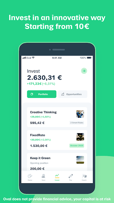
5. Data Visualization
We see a trend shifting towards showing interactive data in mobile designs these days. Better to show highly contextual data using charts, graphs etc. than using simple text for statistics. Take a look at this design.
With data visualization in mobile design, you allow users to interact with data depending on their preferences. It makes the experience highly personal.
The pudding shows some excellent data visualization regarding the spectrum of skin tones presented on the cover of Vogue:

This depiction is far better than just saying, “Over the magazine’s 200-plus issues, 75% of Vogue’s cover models tend more towards fairer skin tones.”
6. Micro Copy (Little things with big impact)
Copy is an integral part of user experience design. Combine the power of copy with design, you can see wonderful engagement levels with your audience.


7. Accessibility
Focusing on users with limited physical abilities allows for better user experience. Approx. 57 million Americans (18.7% of the US population) have some disability issues. An accessibility survey points the following facts -
- 19.9 million (8.2%) have difficulty lifting or grasping. This could, for example impact their use of a mouse or keyboard.
- 15.2 million (6.3%) have a cognitive, mental, or emotional impairment.
- 8.1 million (3.3%) have a vision impairment. These people might rely on a screen magnifier or a screen reader, or might have a form of color blindness.
- 7.6 million (3.1%) have a hearing impairment. They might rely on transcripts and / or captions for audio and video media.
You definitely don’t want your product to be another case similar to Dominos v/s Guillermo Robles.
Google Live Transcribe is an example of an accessible product. Read more about it here — https://research.google/blog/real-time-continuous-transcription-with-live-transcribe/

8. Neumorphism
You will find a lot of neumorphic designs on the web including Dribbble and Behance. It finds inspiration from skeuomorphic design. This style focuses on subtle contrast, solid colours and playing with shadows. More of UI than UX. I have seen more and more people ask for neumorphic designs in context to product development. Though I personally feel these are a little less accessible.
Play around with this tool to get a hang of it — https://neumorphism.io/#55b9f3

9. Glass morphism
Similar on the lines of neumorphism, this is another more of a UI trend than UX. Glass morphism is gaining much popularity as it tends to be similar to a glass-like look.

10. Artificial Intelligence
AI is now seeing a rise in the front end side of things. It is no more limited to backend. Netflix is a prime example of an AI driven app. It uses sophisticated algorithms to deliver personalized content.
75 percent of users select movies based on the company’s recommendations, and Netflix wants to make that number even higher. — Netflix Senior Data Scientist Mohammad Sabah

Spotify uses AI to show recommendations based on a user’s past preferences.

11. 3D
From 3D illustrations to 3D charts and graphs, mobile ux design will see a lot of these elements in the days to come. These allow for more interactive and lively experiences for users.

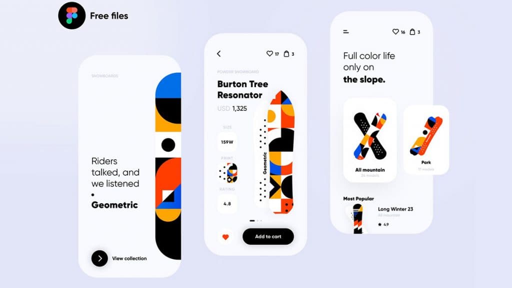
12. Character Designs
Another interesting trend in design worth watching. Both 2D and 3D character designs are picking up when it comes to UX/UI designs. I feel it ensures a better storytelling experience allowing products/companies to build a more personalized brand. Check out some cool designs -

13. Animation and Motion Design
Animation takes UX design to another level. However, the crux is not to overdo it. Micro-interactions when kept subtle deliver delightful experiences.
Reflectly does a fantastic job at motion design. Check out the video.

14. Machine Learning and Data Science
Products are trying to learn more and more about user behaviour through data and machine learning. It is never easy to predict behavior. Getting data is the easy part. But when done carefully, you get a phenomenal user experience.
15. Super Button
Apple recently introduced the ‘Sign in with Apple ID’ button. This works like a super button. No more using social media to sign in to an app.
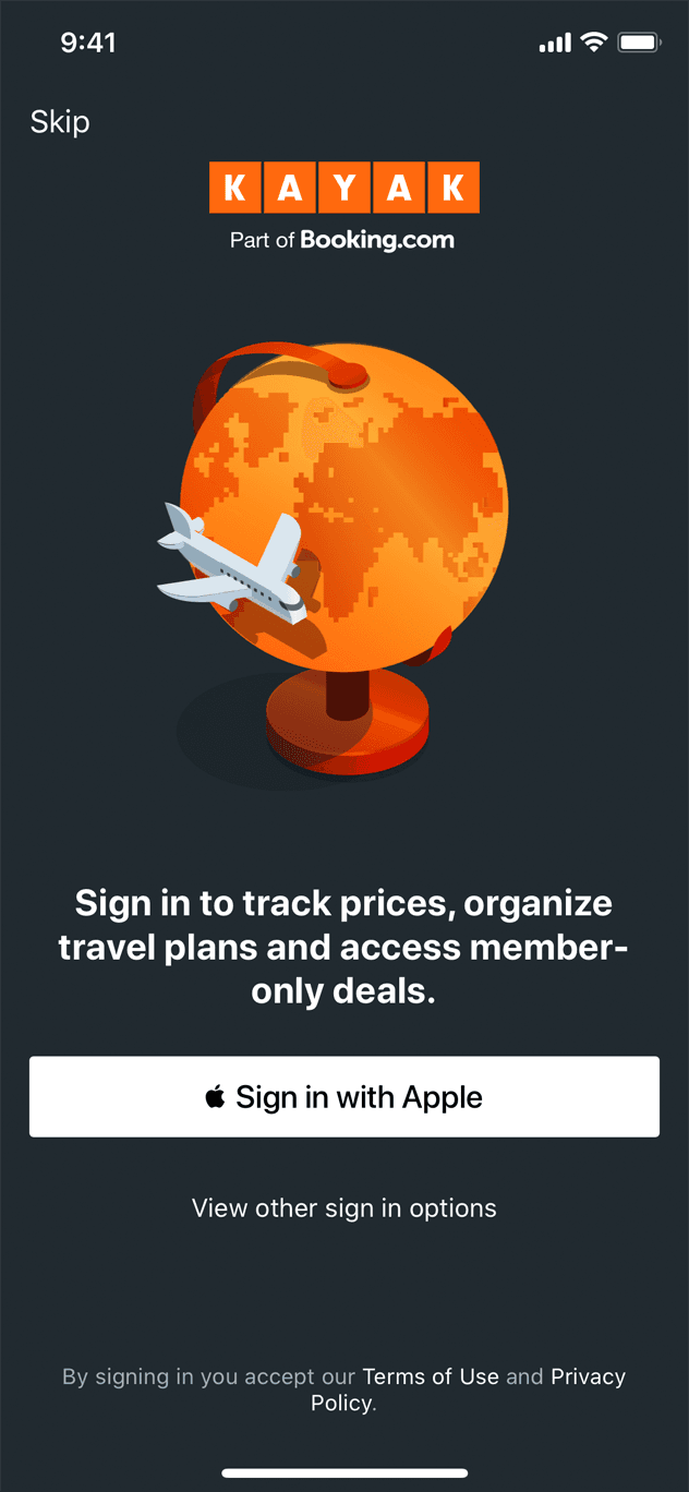
People can skip filling out forms and other lengthy details thus improving the overall app ux. Sign in with Apple also makes it easier for people to authenticate with Touch ID or Face ID. It also has two-factor authentication built in for an added layer of security.
16. People-first
More product owners are gradually inclining towards building mobile experiences for users rather than satisfying their own egos (which is a brilliant thing). When you focus more on user behavior to take product decisions, you can’t go wrong.
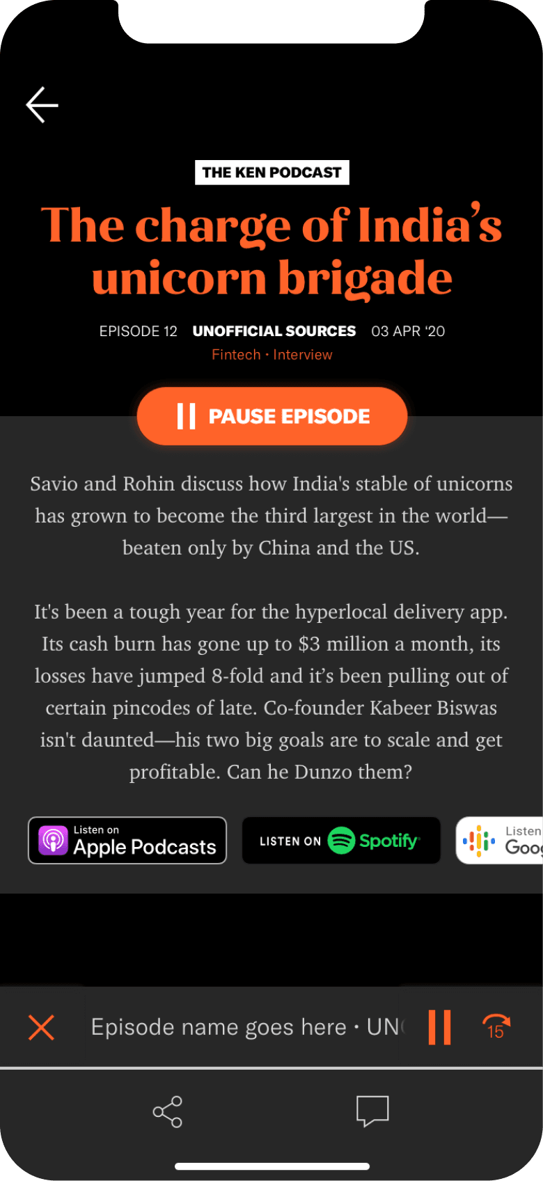
17. Dark theme
I have witnessed a lot of websites and apps offering toggle buttons that let users view screens in dark mode. This reduces strain on eyes especially when you are reading or browsing at night. Infact, we even optimized our blog for dark theme for readability at night. Also, one of the apps we built recently for Ken (a subscription based app in India) has the dark mode feature.
18. Empty States
When there’s no data or information you have to share with users, empty state screens offer a wonderful opportunity to take designs to the next level.
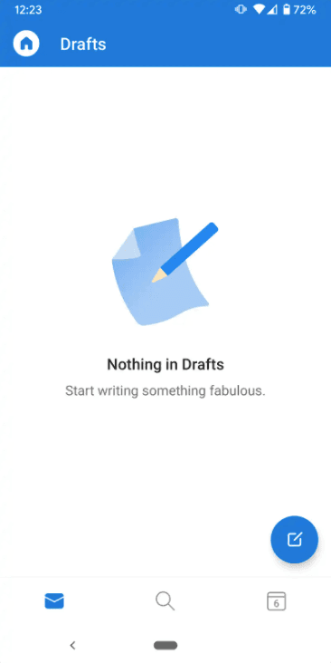
We are witnessing a lot of apps using this space to better connect with an audience and make them take relevant actions.
19. Designing for Equity
This is a design practice where you design for minority communities. The process ensures that the goals of these users are met and the end-result offers a solution to inequality.
20. Typography
Mobile websites and apps, these days, are realizing the importance of a good typography. Even with no images, typography has the power to deliver the best user experience. If it goes with your brand’s personality, don’t hesitate to create your own rules. Selecting the right font also helps make your product/website better in terms of accessibility.

21. Geometric Shapes
Designers are experimenting with abstract shapes and even geometric shapes to craft a unique experience for users.

22. Minimalism
Following the ‘less is more’ philosophy, minimalistic mobile designs are very common these days. This sort of design tends to use considerable white space for appealing looks and less distraction.


23. Super apps
A super app has multiple purposes instead of one. For instance, you can book tickets, order meals and pay bills using one app. Paytm is one of the most popular super apps in India. It started as a digital wallet and has quickly morphed into offering financial services, entertainment, shopping, bill payment etc. under a single application. The recent addition being gaming.
In 2019, Paytm’s former Senior VP Deepak Abbot had said in an interview, “We have created Paytm as a super app that encompasses all their daily payment needs instantly.”

Similar to Paytm, WeChat is a popular multi-purpose app in China and Gojek in Indonesia.
24. Onboarding and personalizations
When mobile app development had picked up, no one focused on offering a holistic onboarding experience. But these days, its quite common for apps to use onboarding to help users understand what the app is all about.

Along with onboarding, apps now tend to deliver highly user-specific advanced personalizations. An example of this would be YouTube. My home page in the YouTube app would be completely different than yours. Because we watch different content.
25. Cross Platform UX
With the advent of platforms like Flutter, startups and established corporations are going for cross platform UX experiences that feel like native. Reflectly shifted to using Flutter to deliver a consistent experience to its cross platform users.
26. Variable Fonts
My designers and developers have always had this tussle when it came to using creative fonts. Why? Dave Crossland and Laurence Penney sum up this issue very nicely in this post -
Web developers measure every asset, including fonts, for their impact on latency. If the information hierarchy in a layout calls for multiple font weights and styles, developers might make decisions — like using smaller fonts, and fewer fonts — that compromise typography for the sake of page-loading time.
The solution? Back in 2016, the biggies like Microsoft, Apple, Adobe, and Google presented a remarkable solution: OpenType variable fonts.
A variable font file contains every font in a traditional static font family. This is an immediate win in terms of raw file size, as it compactly packages the entire font family. The more static fonts that are replaced, the more dramatic the savings become — even up to 70% compression for very large font families.
Now designers can be rest assured that the UX/UI isn’t compromised while developers can be happy about page loading times.
Did we miss out on any mobile design UX trend? Let us know your thoughts in the comments below.