
Web design plays a very important role in success of a website. An SEO friendly and easy to navigate design would receive more response than the one that is not optimised. In today’s time, with all the DIY tools at our disposal, almost anyone can create a stunning web-design in no time. But, it doesn’t mean that everyone knows best practices associated with creating them. For making the site look professional and let customers keep from bouncing, here are some common mistakes that you should avoid.
A splash page
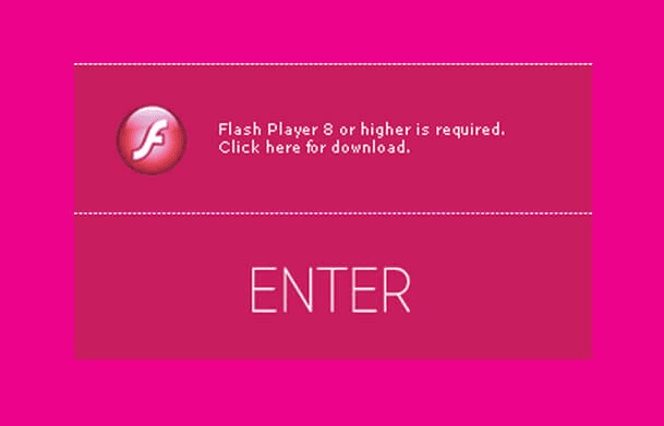
A splash page is nothing but distraction for the users. It hinders the usability from users point of view. It has been observed that sites with a splash page as their home page have a higher bounce rate as users cannot immediately find anything they are looking for. Using a splash page to communicate a message is a bad idea, instead use a pop up window and have a static home page.
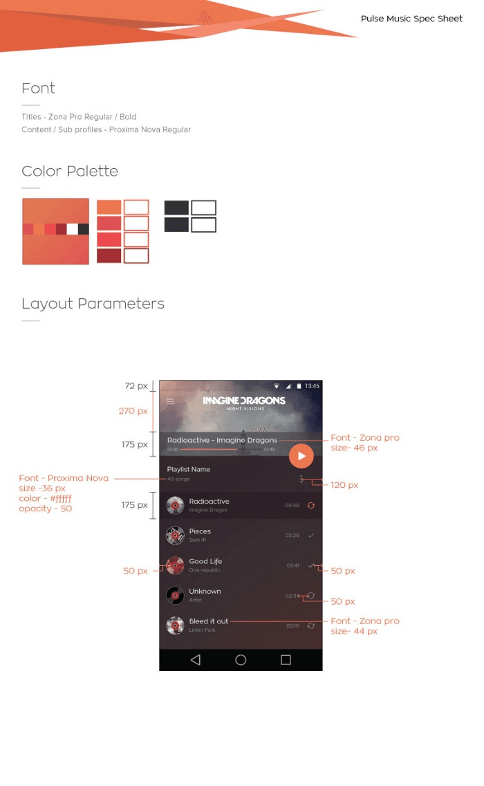
Inconsistency throughout
Every site follows a colour code and scheme and they adhere to it through out. A site without any colour code and various colours splattered across the site with design inconsistency looks more like a spam site. It would not convey professionalism and users are sure to run in the opposite direction looking at a site like that.
Web and Mobile Development companies these days provide all their clients with a colour scheme and code even before starting to develop a site. Once that is finalised, the site is developed based on the decided pallet.
Don’t be too creative with navigation bar
Designers love to experiment new things; they get creative at every step but that doesn’t mean you make the task of navigating through the site very difficult for the users. Keep the navigation simple, mostly horizontal and with drop down menus. Keep it consistent on all pages and it will work for you. Leave that area out for creativity.
Always make the logo clickable
Web and Mobile development companies have introduced a guideline to always make the logo clickable going to home page. It’s a standard practice and users are very much used to it. If your logo is not clickable they will get lost and would not know how to go back. Most of them would think of your site as broken and immediately leave.
Using a lot of Big Images

Images tend to slow the website. If you upload a lot of big images, the site would work very slow. A recent study shows that approx. 40% people would leave the site if image takes a lot of time to load. It is equal to losing half of your site visitors. Make sure to reduce the image pixels before using them.
Graphics instead of texts
It is mandatory to have your site searchable by the search bots. Images prevent the site from crawling and would reflect negativity in your SEO.
So instead of using:
use the below one with the text overlaying it[and the same goes for the logo as well]. Checkout our website for the same:
Over usage of stock images
While stock images are very pretty and attractive; most people know a stock image when they see one. Using a lot of them would make your site cheap and would lose its authenticity. Make sure to use more original images than the stock.
Too much text
Too much text is also bad. Everyone likes neat and clean designs. If the designer is using every available white space to cramp it up with something or the other, the site would lose its visual value and make it less appealing. Such sites are distractive and less informative as most of the time, the user is lost on what to look at.
Checkout this answer on the UX stackexchange website as well
Cross browser compatibility
You cannot be sure about what browser anyone in this world might be using. Some might opt to use a different than what you have thought of. Making sure of site’s compatibility on all browsers is a smart way to work around the websites.
Mobile and Web Development companies are in the habit of using a cross development testing tool to test the issues related to cross browser compatibility such as BrowserStack.
Automated music play
They are attractive, works some time but doesn’t most of the time. You should evaluate your services and products and decide on whether you really need that sound.
Responsiveness
Mobile users surpass the desktop users and if the site is not mobile friendly, you lose more than half of visitors.
Creating a visually appealing site is easy but to create it within set guidelines is difficult. Avoiding these small and common mistakes would help you ensure the success and reach of the site. It would justify your goal better.
About Solute TechnoLabs LLP
We are a bunch of passionate technocrats who love building products and applications that we take pride in. Our mobile and web applications have been downloaded and used by millions and we’re here to change the internet: One piece at a time!